Instructions
- Answer all questions.
- The number of marks available is shown in [ ] after each question or part.
- Write your answers in the spaces provided.
Question 1 — Population Growth
Parts (a), (b) and (c) • 25 marks total
(a)
Study Fig. 1.1, which shows information about population growth in Australia (an MEDC).
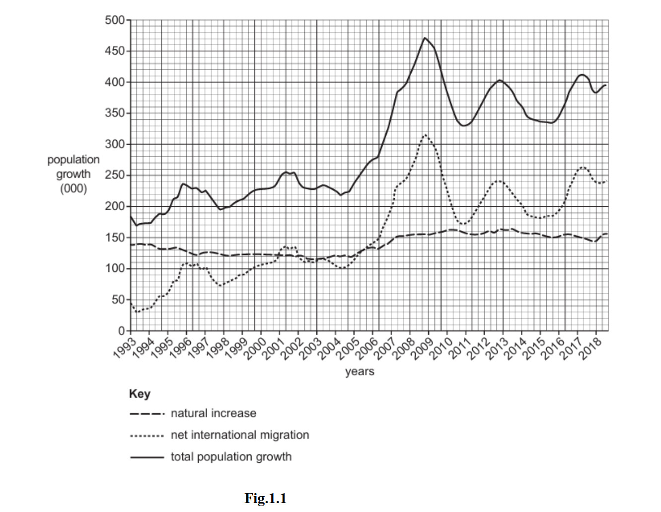
Fig. 1.1
(i) In which year was total population growth the highest in Australia? [1]
(ii) Identify from Fig. 1.1 a year when: [2]
net international migration and natural increase were the same amount
total population growth decreased
(iii) Explain how the following are calculated: [3]
natural increase
net international migration
total population growth
(iv) Using Fig. 1.1, compare natural increase and net international migration between 1993 and 2018. You should refer to years and use statistics in your answer. [4]
(b)
Study Fig. 1.2, which shows information about population growth in The Gambia (an LEDC in Africa).
The Gambia has had a consistently high population growth rate of 4.2% for the last thirty years. ‘The main reasons include polygamy, the fact that the use of contraceptives is not common and a general reduction in infant mortality rates.’
Since 1993 a family planning programme has attempted to increase the use of modern contraceptives and reproductive health services in The Gambia. An increase in the use of contraceptives has been achieved through community health nurses and information campaigns.
Fig. 1.2
(i) Suggest three reasons why the use of contraceptives is not common in The Gambia. [3]
1.
2.
3.
(ii) Explain why it is difficult to reduce natural population growth rates in LEDCs, such as The Gambia, even though the use of contraception has recently increased. [5]
(c)
For a named country you have studied, describe the problems caused by a high rate of population growth. [7]
Name of country:
Question 2 — Population Structure
Parts (a), (b) and (c) • 25 marks total
(a)
Study Fig. 2.1, which shows information about the world’s population structure in 1950, 2015 and 2100 (estimated).
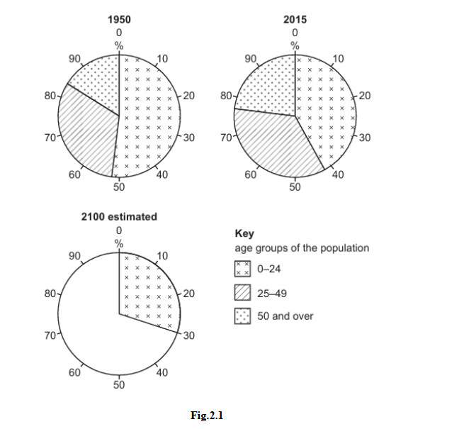
Fig. 2.1
(i) What is meant by population structure? [1]
(ii) Complete Fig. 2.1 using the following information about the estimated population in 2100. [2]
| Age group | Percentage of total population |
|---|---|
| 25–49 years | 30 |
| 50 and over | 40 |
On the original paper: draw and label the 25–49 and 50 and over sectors on the 2100 pie chart using the data above.
(iii) Using information from Fig. 2.1 only, describe the changes in the world’s population structure between 1950 and 2015. [3]
(iv) Suggest reasons for the changes in the percentage of the population aged between 0 and 24 years from 1950 to 2015. [4]
(b)
Study Fig. 2.2, which is a population pyramid for Niger (an LEDC in Africa) in 2015.
Fig. 2.2
(i) Describe three features of the population pyramid of Niger which are typical of an LEDC. [3]
1.
2.
3.
(ii) Explain why the proportion of old dependents in an MEDC is likely to differ from that of Niger. [5]
(c)
For a named country you have studied, describe the problems caused by a large dependent population. [7]
Name of country:


